Westwell’s designer and illustrator Galia talks about the inspiration behind our labels.
When we first took over Westwell back in 2017, the very special terroir was the recurring theme of all of our conversations. We marvelled at the site, and whilst there on one of our early visits, we took photographs of the vines and the soil. As soon as we got home, I sat down to sketch a detail from one of the soil photographs that we’d taken and immediately got lost inside the incredible detail - the rocks, leaves and sticks - and the earth itself - sand, clay and chalk. The idea for the wine labels came very organically from these sketches.

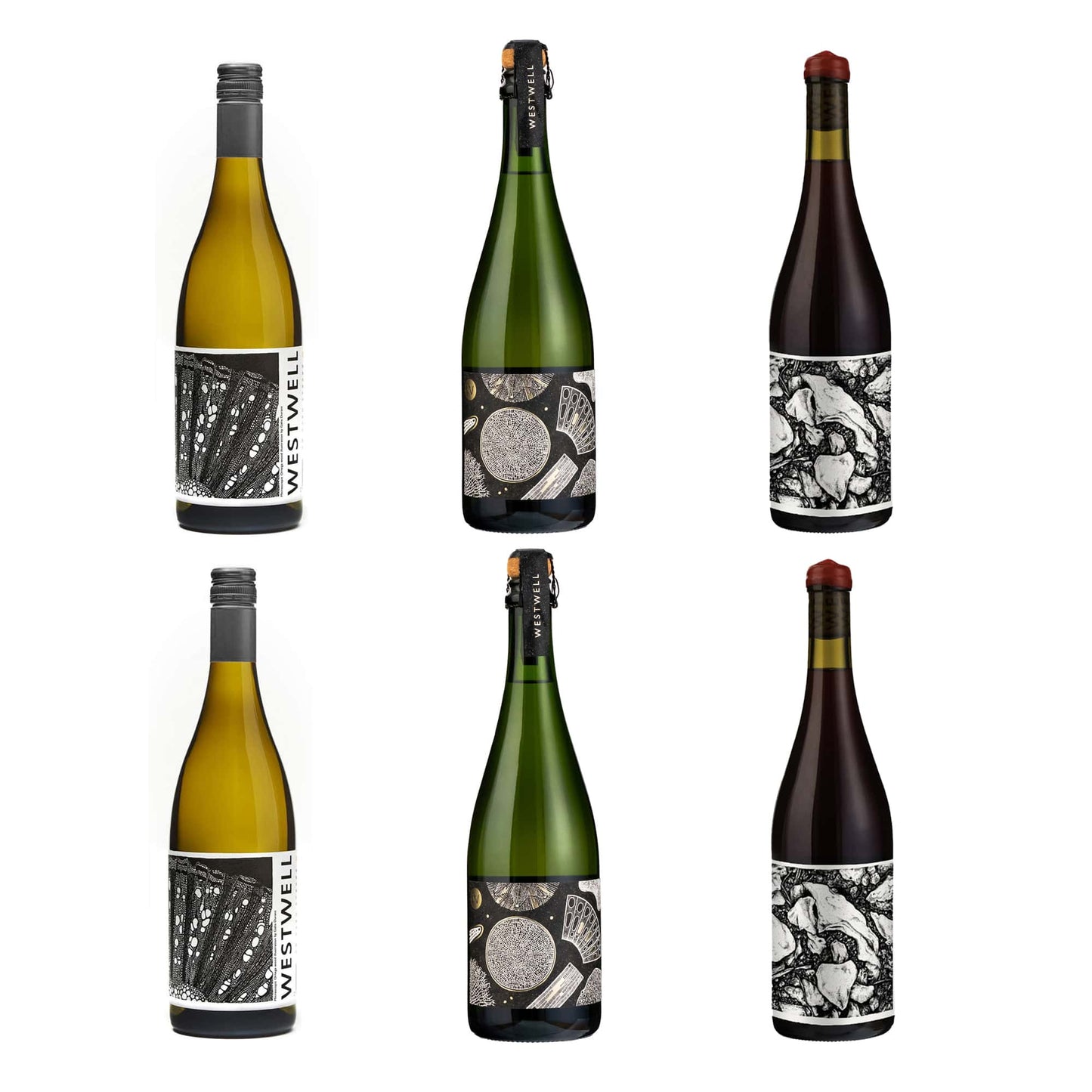
After that initial soil drawing, we talked about what wild yeasts, vine wood, leaves and earth would look like under a microscope. We found a Swiss photographer, Werner Schoch, who specialises in photographing paper-thin slices of wood under a microscope, and we sent him some of the Ortega vine wood from pruning. What he sent back was incredibly exciting - beautiful photos which looked like abstract pieces of art. I drew from one of these and that drawing now features on our Ortega still white label.


For the Ortega Skin Contact, we took a similarly literal path - I drew from a photograph that Adrian had taken of the whole bunches macerating during ferment. Our Chardonnay label is a drawing of the dead Chardonnay vine wood after pruning and the Westwell Field Blend is a composite illustration of a cross section through the earth at the vineyard.

For our premium range of sparkling wines - Blanc de Noirs, Special Pink and Special Cuvee, we went even further under the microscope. The labels feature illustrations of the microscopic sea creatures which make up the chalk in the vineyard. Chalk is a sure-fire clue that Westwell - and much of Kent - was once under water. It’s actually made from prehistoric fossilised microscopic sea creatures called coccoliths and diatoms. They tell an important story of the provenance of the land and have an impact on the wines we make which we wanted to reflect on our packaging.
My drawing method is very straightforward - I use a Muji 0.38mm black pen on cartridge paper, first sketching out in pencil and then working slowly and deliberately from photos or collaged photos to produce the illustrations. They take on average about 25 hours to draw.

The illustrations are only part of the story on our labels. We also made a choice to be very transparent with our process - they feature a ‘recipe’ - explaining exactly how we made each bottle of wine. As a wine drinker, this interests us, so it made sense to include this for our audience.
We’re looking forward to moving from tiny detail to the big picture next - creating our tasting room and cellar door offering. We’ll be looking at how we integrate the drawings and the brand into our new large space.
There are so many stories to tell in the soil and the vines - and lots of new wines in the pipeline - so I’m looking forward to getting out my pen again very soon.


